library(tidyverse)
library(here)
library(ggplot2)
library(plotly)
library(shiny)
library(ggthemes)Visualization Exercise
NBA Win Percentages
About the Data
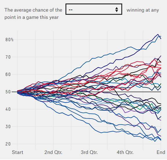
This dataset comes from FiveThirtyEight’s article, “Every NBA Team’s Chance Of Winning In Every Minute Across Every Game”. The article analyzes each NBA team’s chance of winning at every minute of a game, averaged across the entire season. The data are available on GitHub. Below is a static image of the interactive figure that I will be attempting to recreate.

Loading/Cleaning the Data
nba_data <- read_tsv(here::here("visualization_exercise", "data", "nba.tsv"))
head(nba_data)
# A tibble: 6 x 50
team `0` `1` `2` `3` `4` `5` `6` `7` `8` `9` `10` `11`
<chr> <dbl> <dbl> <dbl> <dbl> <dbl> <dbl> <dbl> <dbl> <dbl> <dbl> <dbl> <dbl>
1 Hawks 0.507 0.510 0.515 0.516 0.519 0.528 0.533 0.529 0.536 0.540 0.544 0.551
2 Nets 0.503 0.506 0.509 0.515 0.516 0.512 0.526 0.520 0.520 0.522 0.518 0.515
3 Celti~ 0.501 0.504 0.497 0.496 0.492 0.492 0.488 0.482 0.465 0.464 0.479 0.473
4 Horne~ 0.497 0.493 0.493 0.490 0.484 0.484 0.488 0.483 0.475 0.485 0.485 0.491
5 Bulls 0.495 0.494 0.500 0.497 0.482 0.478 0.478 0.482 0.484 0.486 0.485 0.493
6 Caval~ 0.506 0.510 0.516 0.528 0.534 0.546 0.546 0.559 0.553 0.544 0.550 0.551
# i 37 more variables: `12` <dbl>, `13` <dbl>, `14` <dbl>, `15` <dbl>,
# `16` <dbl>, `17` <dbl>, `18` <dbl>, `19` <dbl>, `20` <dbl>, `21` <dbl>,
# `22` <dbl>, `23` <dbl>, `24` <dbl>, `25` <dbl>, `26` <dbl>, `27` <dbl>,
# `28` <dbl>, `29` <dbl>, `30` <dbl>, `31` <dbl>, `32` <dbl>, `33` <dbl>,
# `34` <dbl>, `35` <dbl>, `36` <dbl>, `37` <dbl>, `38` <dbl>, `39` <dbl>,
# `40` <dbl>, `41` <dbl>, `42` <dbl>, `43` <dbl>, `44` <dbl>, `45` <dbl>,
# `46` <dbl>, `47` <dbl>, `48` <dbl>I will have to reorganize the variables to allow for easier analysis and plotting. Currently, winning percentages are listed for each team at each minute of the game, with the corresponding column labeled after that minute (0, 1, 2,…48). I will need to tidy this to create new columns for minute and win percentage. Once completed, I should have three variables - team, minute, and win percentage.
nba_data <- nba_data %>%
  tidyr::pivot_longer(!team,
    names_to = "minute",
    names_prefix = "min",
    values_to = "win_percentage",
    values_drop_na = TRUE ) %>%
  dplyr::mutate(minute, as.numeric(minute))

nba_data
# A tibble: 1,470 x 4
team minute win_percentage `as.numeric(minute)`
<chr> <chr> <dbl> <dbl>
1 Hawks 0 0.507 0
2 Hawks 1 0.510 1
3 Hawks 2 0.515 2
4 Hawks 3 0.516 3
5 Hawks 4 0.519 4
6 Hawks 5 0.528 5
7 Hawks 6 0.533 6
8 Hawks 7 0.529 7
9 Hawks 8 0.536 8
10 Hawks 9 0.540 9
# i 1,460 more rowsPlotting
I want to create a color palette similar to what was used in the original figure (not aiming for complete accuracy). I will try to match the teams with their corresponding team color.
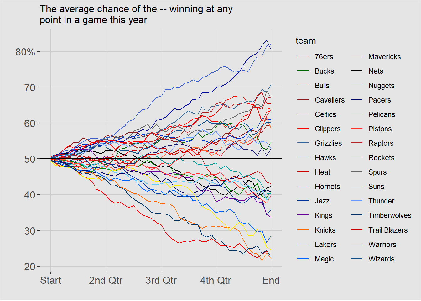
nba_colors <- c("red2", "darkgreen", "firebrick2", "firebrick4", "green4", "red1", "#336699", "#000999", "#CC0000", "#009999", "#003399", "#660099", "#FF6600", "#FFF000", "#0066FF", "#0033CC", "black", "#66CCFF", "#000666", "midnightblue", "#FF3333", "firebrick", "red", "gray40", "#FF6633", "#6699FF", "#003366", "red3", "royalblue3", "dodgerblue4")Before trying to recreate the interactive portion of the plot, I want to plot a static version to make sure everything looks the way it should.
nba_plot <- ggplot(nba_data, aes(`as.numeric(minute)`, win_percentage, color = team))+
  geom_line(size=0.5)+
  geom_hline(yintercept = 0.5, size=0.5, color = "black")+
  theme(axis.line.x = element_blank(),
       axis.line.y = element_blank(),
       axis.text = element_text(size = 12))+
  theme(plot.title = element_text(size = 12))+
  theme(panel.grid = element_line(colour = "gray80"),
        plot.background = element_rect(fill = "gray90" ),
        panel.background = element_rect(fill = "gray90"),
        panel.grid.minor = element_blank(),
        legend.key = element_rect(fill = "gray90"),
        legend.background = element_rect(fill = "gray90"))+
  scale_color_manual(values = nba_colors)+
  scale_x_continuous(breaks = c(0, 12, 24, 36, 48),
        labels = c("Start", "2nd Qtr", "3rd Qtr", "4th Qtr", "End"))+
  scale_y_continuous(breaks = c(.2, .3, .4, .5, .6, .7, .8),
        labels = c("20", "30", "40", "50", "60", "70", "80%"))+
  xlab("")+
  ylab("")+
  ggtitle("The average chance of the -- winning at any\npoint in a game this year")
Warning: Using `size` aesthetic for lines was deprecated in ggplot2 3.4.0.
i Please use `linewidth` instead.nba_plot
That looks pretty good, but now I want to make the same figure but in an interactive format to match the original. This is not something I have done before, so I will be learning as I go. It seems like the most simple way is to convert the ggplot into an interactive plotly figure using the function plotly::ggplotly.
ggplotly(nba_plot)This was a straightfoward solution, but I would still like to find a way to include the dropdown selection tool from the original FiveThirtyEight figure.
#select some plotly buttons to remove
remove_buttons <- list('zoom2d','pan2d','lasso2d', 'select2d','zoomIn2d',
                              'zoomOut2d','autoScale2d','hoverClosestCartesian',
                              'toggleSpikelines','hoverCompareCartesian')

#replot and filter for team
nba_plotly <- ggplotly(nba_plot, autosize = F, width = 650, height = 550,
         transforms = list(
      list(
        type = 'filter',
        target = ~team,
        operation = '=',
        value = unique(nba_data$team)[1])))

#remove some buttons to de-clutter
nba_plotly <- nba_plotly %>%
  config(displaylogo = FALSE, modeBarButtonsToRemove = remove_buttons)

#remove legend and create dropdown list, this is painful
nba_plotly <- nba_plotly %>%
    layout(showlegend = FALSE,
    updatemenus = list(
      list(
        type = 'dropdown',
        active = 0,
        buttons = list(
          list(method = "restyle",
               args = list("transforms[0].value", unique(nba_data$team)[1]),
               label = unique(nba_data$team)[1]),
          list(method = "restyle",
               args = list("transforms[0].value", unique(nba_data$team)[2]),
               label = unique(nba_data$team)[2]),
          list(method = "restyle",
               args = list("transforms[0].value", unique(nba_data$team)[3]),
               label = unique(nba_data$team)[3]),
          list(method = "restyle",
               args = list("transforms[0].value", unique(nba_data$team)[4]),
               label = unique(nba_data$team)[4]),
          list(method = "restyle",
               args = list("transforms[0].value", unique(nba_data$team)[5]),
               label = unique(nba_data$team)[5]),
          list(method = "restyle",
               args = list("transforms[0].value", unique(nba_data$team)[6]),
               label = unique(nba_data$team)[6]),
          list(method = "restyle",
               args = list("transforms[0].value", unique(nba_data$team)[7]),
               label = unique(nba_data$team)[7]),
          list(method = "restyle",
               args = list("transforms[0].value", unique(nba_data$team)[8]),
               label = unique(nba_data$team)[8]),
          list(method = "restyle",
               args = list("transforms[0].value", unique(nba_data$team)[9]),
               label = unique(nba_data$team)[9]),
          list(method = "restyle",
               args = list("transforms[0].value", unique(nba_data$team)[10]),
               label = unique(nba_data$team)[10]),
          list(method = "restyle",
               args = list("transforms[0].value", unique(nba_data$team)[11]),
               label = unique(nba_data$team)[11]),
          list(method = "restyle",
               args = list("transforms[0].value", unique(nba_data$team)[12]),
               label = unique(nba_data$team)[12]),
          list(method = "restyle",
               args = list("transforms[0].value", unique(nba_data$team)[13]),
               label = unique(nba_data$team)[13]),
          list(method = "restyle",
               args = list("transforms[0].value", unique(nba_data$team)[14]),
               label = unique(nba_data$team)[14]),
          list(method = "restyle",
               args = list("transforms[0].value", unique(nba_data$team)[15]),
               label = unique(nba_data$team)[15]),
          list(method = "restyle",
               args = list("transforms[0].value", unique(nba_data$team)[16]),
               label = unique(nba_data$team)[16]),
          list(method = "restyle",
               args = list("transforms[0].value", unique(nba_data$team)[17]),
               label = unique(nba_data$team)[17]),
          list(method = "restyle",
               args = list("transforms[0].value", unique(nba_data$team)[18]),
               label = unique(nba_data$team)[18]),
          list(method = "restyle",
               args = list("transforms[0].value", unique(nba_data$team)[19]),
               label = unique(nba_data$team)[19]),
          list(method = "restyle",
               args = list("transforms[0].value", unique(nba_data$team)[20]),
               label = unique(nba_data$team)[20]),
          list(method = "restyle",
               args = list("transforms[0].value", unique(nba_data$team)[21]),
               label = unique(nba_data$team)[21]),
          list(method = "restyle",
               args = list("transforms[0].value", unique(nba_data$team)[22]),
               label = unique(nba_data$team)[22]),
          list(method = "restyle",
               args = list("transforms[0].value", unique(nba_data$team)[23]),
               label = unique(nba_data$team)[23]),
          list(method = "restyle",
               args = list("transforms[0].value", unique(nba_data$team)[23]),
               label = unique(nba_data$team)[23]),
          list(method = "restyle",
               args = list("transforms[0].value", unique(nba_data$team)[24]),
               label = unique(nba_data$team)[24]),
          list(method = "restyle",
               args = list("transforms[0].value", unique(nba_data$team)[25]),
               label = unique(nba_data$team)[25]),
          list(method = "restyle",
               args = list("transforms[0].value", unique(nba_data$team)[26]),
               label = unique(nba_data$team)[26]),
          list(method = "restyle",
               args = list("transforms[0].value", unique(nba_data$team)[27]),
               label = unique(nba_data$team)[27]),
          list(method = "restyle",
               args = list("transforms[0].value", unique(nba_data$team)[28]),
               label = unique(nba_data$team)[28]),
          list(method = "restyle",
               args = list("transforms[0].value", unique(nba_data$team)[29]),
               label = unique(nba_data$team)[29]),
          list(method = "restyle",
               args = list("transforms[0].value", unique(nba_data$team)[30]),
               label = unique(nba_data$team)[30])
        )
      )
    )
  )

nba_plotly
Final Thoughts
I was successful at creating a dropdown menu, but was unable to actually link it to the figure in a way that made it functional. There also must be an easier way to create the dropdown list without having to code an argument for each team individually, but I can’t find it.
Some tools I referenced when completing this exercise where the books Interactive Web-Based Data Visualization with R, Plotly, and Shiny and The Epidemiologist R Handbook, along with various webpages and coding forums. The books both contain very helpful information on many aspects of data visualization, including making interactive figures.